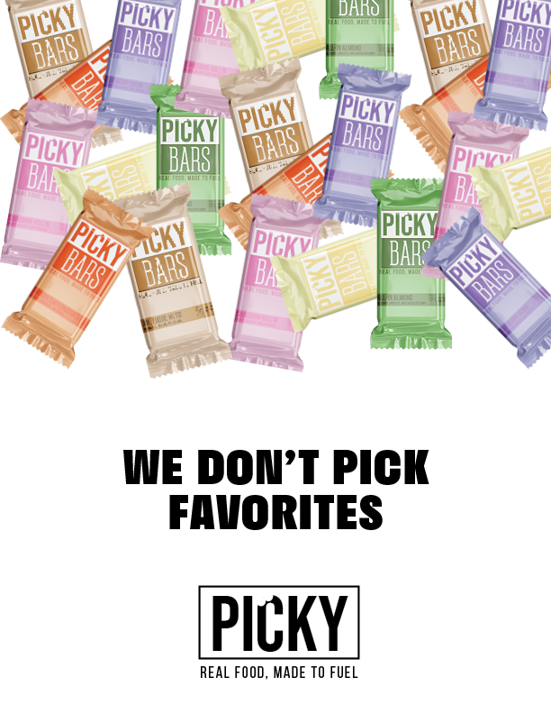
picky bars
the ask: design & execute an entire rebrand for Picky Bars
the campaign: I looked at this opportunity like another episode of extreme makeover, but this time it’s brand edition — just make sure you pick right. The goal of Picky Bars is to fill your body up with the right ingredients to help you achieve your dreams. By purchasing Picky Bars, you are ensured to be fueled for the longest bike ride or just another daily walk.
rebrand
The task was to take the brand Picky Bars and give it a brand new logo and identity — in other words, a makeover! Picky Bars was designed to be a perfectly balanced performance bar made by athletes for athletes, but was struggling in a few areas. That’s where the fun comes in! I got the opportunity to redesign the brand and help update aspects they were lacking, all while staying true to the original roots.
old
old
new
new
colorway
typography
These colors are a combination of earthy, nature-like tones mixed with bright energetic. They were strategically picked to represent all aspects of the bar whether it be used to just explore the outdoors or win first place in the race.
prints


billboards


packaging
simple and clean yet unforgettable — oh, and it all tastes good too!


